How to Style an Entry with Art and Antique Furniture
I recently had the pleasure of spending a morning with Jennifer Farley of Midwest Eclectic, a full-service interior design and remodel company based in Wichita, KS. I love Jennifer’s style and because I have no clue how to decorate, I asked her to help me dress up some of my paintings.
We went over to one of her client’s homes that is currently being remodeled. They have a large, white wall in their entry that we thought would make the perfect setting for a large painting.
Jennifer had three “anchor” pieces of furniture – all garage sale finds! -- that we used to set our scenes. After the furniture and art were in place, we used functional and decorative accessories to complete each look.
Look 1: Small Dresser
For the first look, we used a small dresser. It was about three feet wide, but short. Whether the piece of furniture is your starting point or the piece of art, you want them to be similar in width. This painting is 30”x30.” You want the painting to hang at eye level. This means that if you have a very tall painting, you’ll probably want to pair it with a shorter piece of furniture (if you decide to use furniture at all).

We accompanied the dresser with a chair; the space felt too plain without the chair and pillow and this is a nice place to store extra seating.
The books on top of the dresser are decorative and the plant is a nice complement to the vegetation in the painting. On the right of the dresser we have a small bowl that serves as a “drop zone” – a place to put your keys, phone, mail, etc., when you walk in the house. Of course, the drop zone looks best when it’s not getting a lot of use!
The dresser provides significant storage – you could put hats and gloves here, blankets for the living room, linens that you don’t use often, anything really.

Look 2: Bench
The second look uses a bench. Like I mentioned already, the furniture and art should be similar width. This painting is 40” wide and the bench is around 3.5’ – wide enough for two people. It is unlikely that people will sit in your entry, but this is the perfect place to store a bench that you use for additional seating when you have company.
We used the same books, small plant and drop zone-bowl on top of this bench to fill some space between the top of the bench and the bottom of the painting. We added a nice ceramic vessel and larger plant on the side to complete the look.

Look 3: Console Table
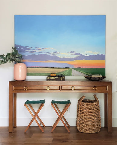
For the last look, we used a gorgeous garage-sale console table. This huge painting is 5’ wide and the table is just slightly wider. A console table is a great option for an entry because they are wide and narrow. This table is less than a foot deep.

We decided to maximize the space by adding some cute, retro stools and a basket under the table. These elements help fill out the look and are useful – the stools serve as extra seating and the basket can be used as storage.
We added plant and book accents on top of the table and made room for the necessary drop zone. The plant and vase are a little large, but we needed something to counterbalance the large painting without competing with it. The pink vase and green eucalyptus leaves are perfect with the colors of the painting.

What do you think? Which look is your favorite? Do you have any styling tips you want to share?


Leave a comment